

Bridging Design Systems and Low-Code Platforms
Collaborating with the Massachusetts Design System team to define an accessible multi-select pattern and evaluate implementation within Appian's low-code framework.
Overview
As part of a broader effort to standardize Appian applications across the Massachusetts Executive Office of Energy and Environmental Affairs (EEA), I collaborated with the Massachusetts Design System (MDS) team to explore an accessible multi-select component pattern.
What began as a question during MDS office hours evolved into a cross-agency collaboration involving design, accessibility, and subject matter experts. Together, we explored how a framework-agnostic design system component could be adapted for use within Appian's low-code platform while balancing accessibility, usability, and technical constraints.

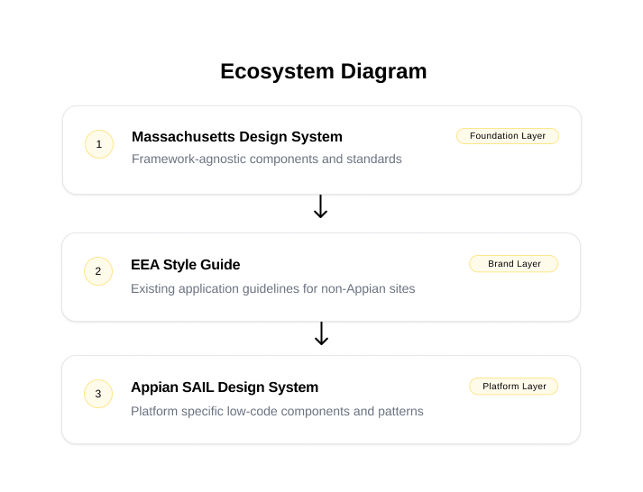
The challenge was translating design system guidance into Appian's out-of-the-box component set while supporting real user workflows. Three layers of standards and constraints informed the final design: the design system, the EEA style guide, and Appian's component framework.
Problem
EEA applications relied heavily on Appian's out-of-the-box components, yet no standardized multi-select pattern existed within the Massachusetts Design System.
At the same time, EEA maintained its own style guide that did not fully align with either MDS guidance or Appian's default implementation.
This created a unique challenge:
How do you create a consistent, accessible experience when the design system, platform, and existing application standards do not fully align?
Rather than immediately designing around Appian's limitations, the team chose to first define the ideal experience. Establishing a framework-agnostic solution allowed us to focus on user needs, accessibility, and best practices before evaluating technical feasibility.
Discovery
I began by reviewing existing EEA applications where multi-select functionality was used and documenting common workflows, edge cases, and user needs.
During early discussions with the MDS design lead, additional scenarios emerged that had not been captured in my initial review. This reinforced an important lesson: fresh perspectives help uncover missing requirements, assumptions leading to a better understanding of the problem.
The goal was not simply to create a component, but to understand how the component functioned within a larger workflow.
Evaluating Multi-Select Use Cases
Reviewing existing application scenarios helped establish a broader understanding of how the component was being used and informed the final recommendation.
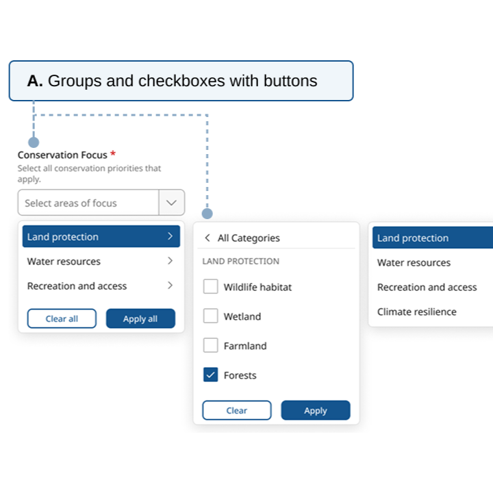
Defining the Ideal State
Before evaluating Appian's limitations, the team focused on defining the ideal user experience.
This allowed us to answer foundational questions:
Should options use checkboxes?
How should selected values be displayed?
What happens when selections exceed available space?
How should the experience adapt across devices?
What accessibility considerations should be prioritized?
By intentionally separating design from technical constraints, it was easier to establish a shared vision before discussing implementation tradeoffs.
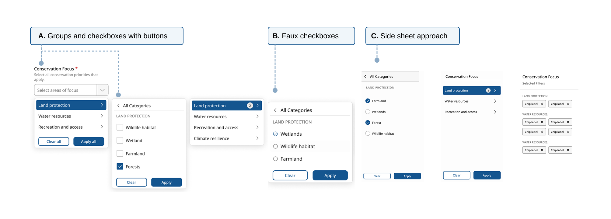
Multiple concepts were explored to evaluate accessibility, discoverability, and technical feasibility.

The ideal-state experience before evaluating Appian's technical limitations.
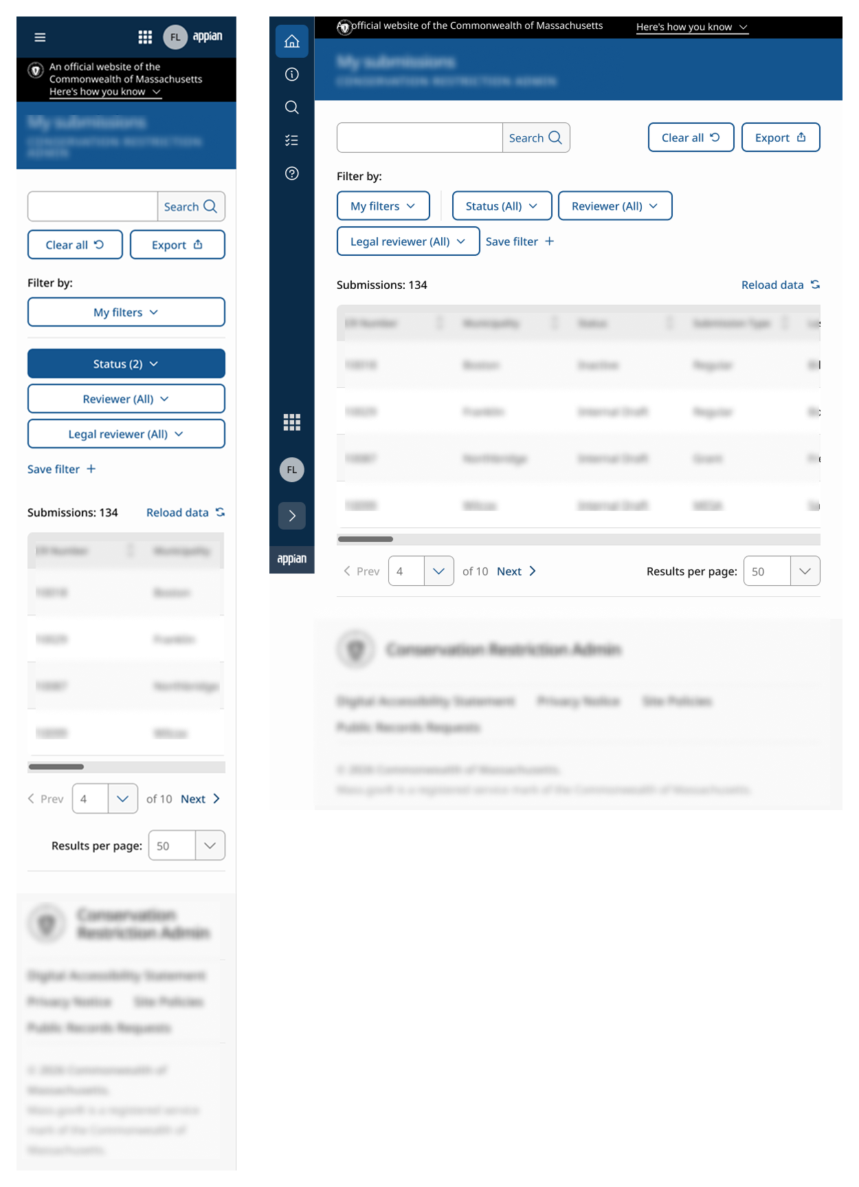
Once the ideal state was defined, I created responsive mobile and tablet versions to demonstrate how the component would behave across different screen sizes.
Accessibility Considerations
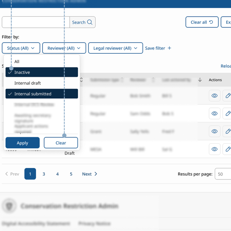
Accessibility remained a central focus throughout the design effort. As we reviewed Appian's existing multi-select component, several usability and accessibility concerns surfaced.
Misleading Selection Indicators
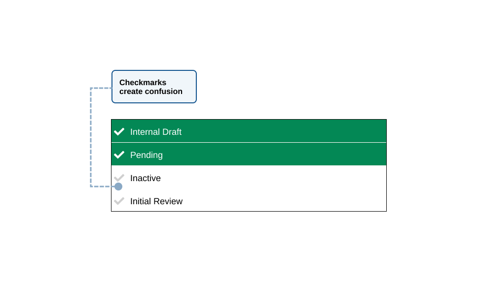
Appian's default multi-select displays checkmark icons that can appear selected even when an option has not been chosen.
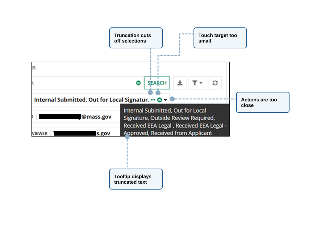
Control Density
The proximity of dropdown triggers, clear action, and selected values raised concerns about accidental activation and touch target size.
Truncated Selections
After making selections, the chosen options appeared inline within the field and were separated by commas. When the text exceeded the available space, it was truncated with an ellipsis, requiring users to hover to view the full list in a tooltip.
Translating the Design into Appian
Once the ideal experience was established, it was easier to begin evaluating what could realistically be implemented within Appian.
This phase revealed an important discovery: many limitations existed not just at the component level, but within larger Appian patterns and framework structures.
Some recommendations that appeared straightforward from a design perspective were actually controlled by higher-level patterns like the “grid”. The grid pattern offered limited control as the search, paging, user filters, and multi-select were connected.
Ideal State
Selected count on multi-select field or button
Flexible placement for global user actions
Refined interaction states
Action buttons within the multi-select dropdown
Appian Reality
Selected count on multi-select not supported
Action placement controlled by grid pattern
Interaction states built into component
No ability to add buttons to multi-select
Key Findings
Through review sessions, the team evaluated the recommendations against Appian's capabilities.
Group items per page with pagination > Depends on the Appian grid style pattern
Move filter actions to a more global location > Set position in grid pattern
Relocate search for clear hierarchy > Controlled by grid pattern structure
Remove persistent check icons > Built into component no ability to change
Display selected counts in multi-select > Not supported
Add apply and clear buttons to multi-select > Unable to add buttons
These findings sparked valuable discussions around platform capabilities, accessibility concerns, and implementation tradeoffs. To support future standardization efforts, I documented the limitations in Jira for tracking, remediation, and potential escalation to Appian.
Outcome
While the component was not implemented during this effort, the initiative produced several meaningful outcomes.
The collaboration:
Helped inform future thinking around framework-agnostic multi-select patterns
Documented Appian constraints and implementation considerations
Created a shared understanding between design, accessibility, and Appian development specialists
Reinforced a project level need for future Appian standardization efforts
Identified opportunities for enhancement as platform capabilities evolve
Most importantly, the work generated a reusable process for evaluating future components against both design system standards and platform constraints.
Key Learnings
This exercise changed how I think about design systems.
Initially, I viewed standardization primarily as a visual consistency challenge. Through collaboration with the Massachusetts Design System team, I gained a deeper appreciation for the complexity of creating reusable components that must support accessibility, multiple use cases, future scalability, and diverse implementation environments.
I also learned the importance of defining an ideal experience before considering technical limitations.
Had we started with Appian's constraints, many opportunities and accessibility concerns would never have surfaced. By establishing a north star first, the team was able to clearly identify where compromises were being introduced and document future opportunities for improvement.
Most importantly, the experience reinforced that successful design system adoption requires more than component libraries. It depends on alignment between design standards, technical platforms, governance, and the teams responsible for implementing them.
Design systems establish what the experience should be. Platforms determine what is possible. This collaboration taught me that the most valuable work often happens in the space between them.