

Collette
A global tour operator that by modernizing their digital experience to increase online bookings by 21% and reduce reliance on customer support.
Overview
Collette is a family-owned tour operator offering over 160 guided tours across all seven continents. Despite strong customer satisfaction with their tours, their website experience lagged behind competitors. To remain competitive, the company needed to modernize its digital experience and build user confidence in booking online.
Problem
Customers trusted the travel experience but not the website.
27% of users relied on customer support to complete bookings, indicating low confidence in the online experience.
Users found the site confusing, disorganized, and difficult to navigate
The brand was perceived as “business-like and cold” by users
This created friction in the booking journey and increased operational costs.
The Challenge
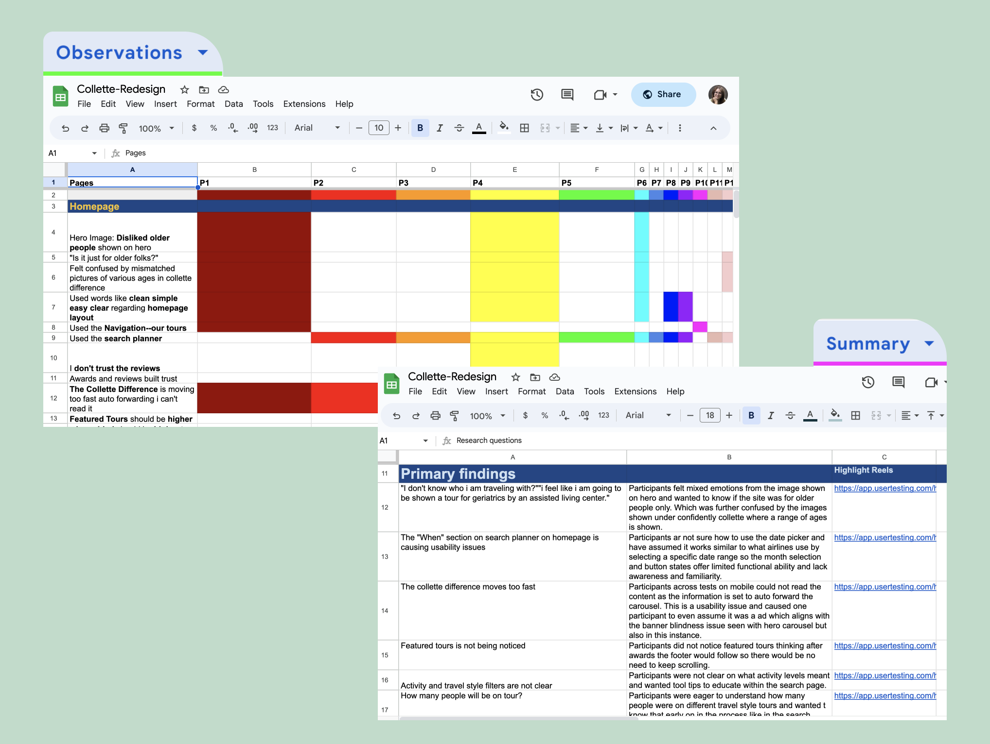
To understand the problem space, I conducted:
User interviews
Contextual interviews with customer service
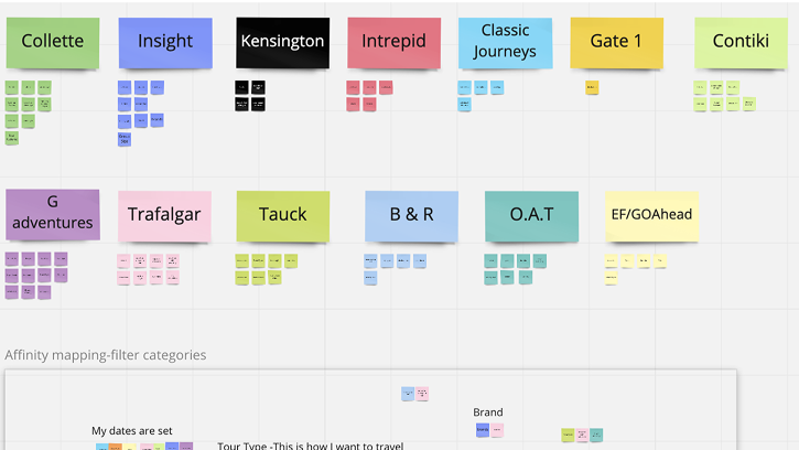
Competitive analysis
I analyzed:
14 direct competitors
10 indirect competitors
10 e-commerce experiences
Key Insight:
Competitors succeeded by combining strong brand identity, intuitive navigation, and consistent design systems. These were areas where Collette was falling short.
Key User Pain Points
Lack of clear brand identity led to low trust
Confusing homepage created difficulty understanding offerings
Poor navigation left users struggled to find tours
Inconsistent UI patterns reduced usability and confidence
Design Strategy
To address key usability and trust issues, I focused on three core areas:
-
Create a cohesive and approachable identity
Build trust through transparent content and unbiased reviews
Set clear expectations about the tour experience
-
Audit language used across the site for clarity
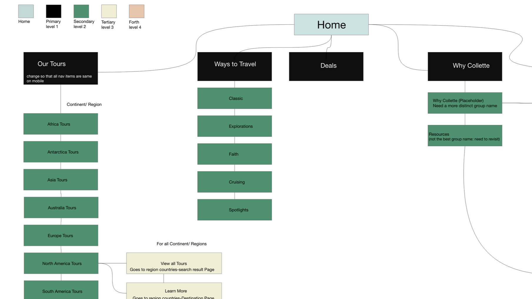
Evaluate and restructure the site’s information architecture
Redesign the sitemap to align with user goals
-
Create a source of truth for cross-functional teams
Audit existing digital and print assets
Develop a scalable component library
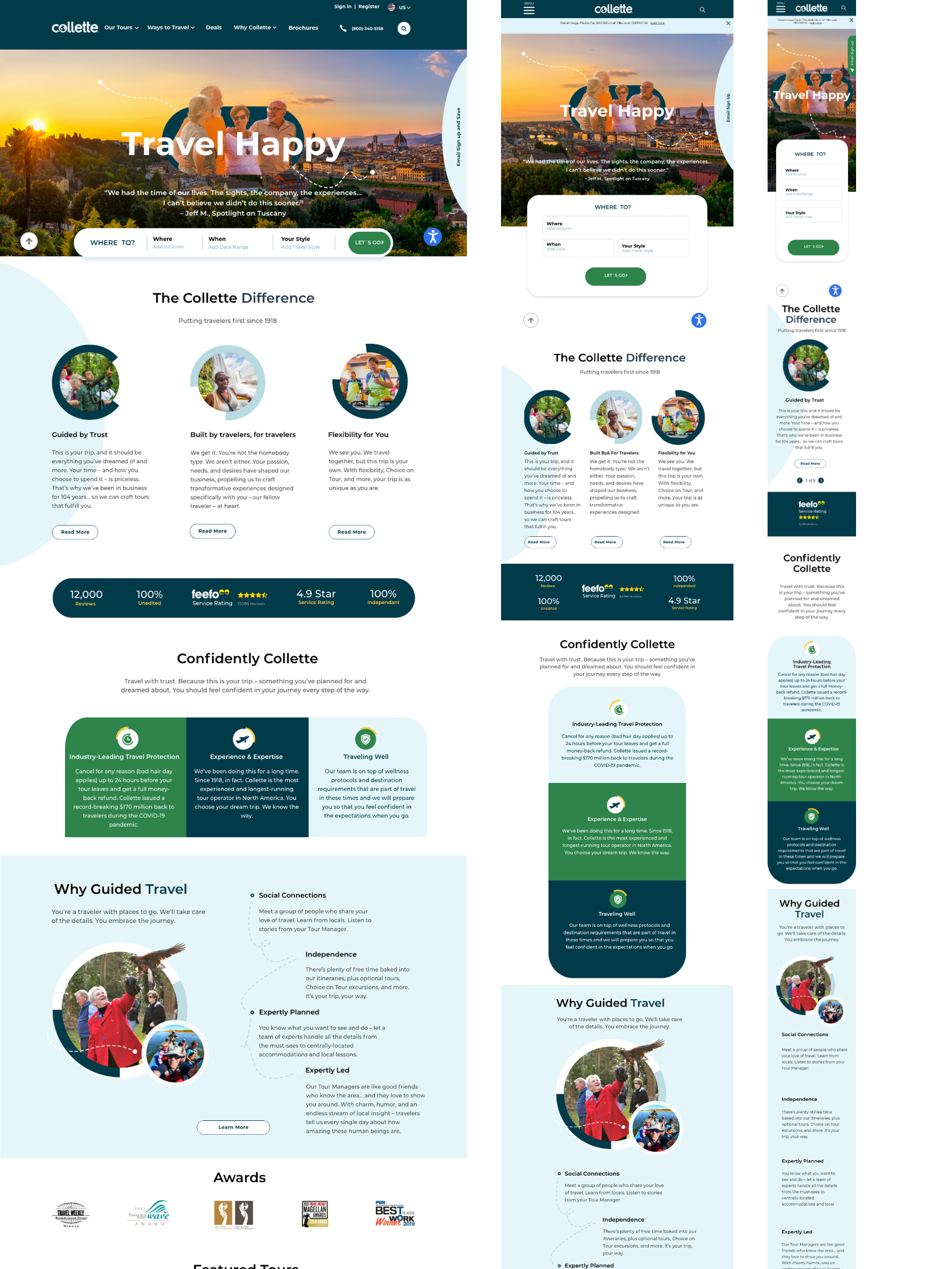
Homepage Redesign
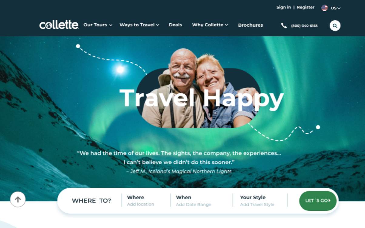
The homepage was the highest-impact opportunity. It sets the stage for expectations and value.
Key improvements
Removed carousel:
Eliminated a major usability issue reported by 90% of usersIntroduced structured content sections:
Clearly communicated value and offeringsSimplified primary actions:
Reduced multiple competing CTAs into one clear pathIntegrated tours directly into navigation:
Reduced friction when browsing destinationsIntroduced vertical tour cards:
Made tours more scannable and engaging
Design System Development
Built a scalable typography system using rem units
Created a shared component library in Adobe XD
Audited and standardized iconography
Ensured consistency across web and print experiences
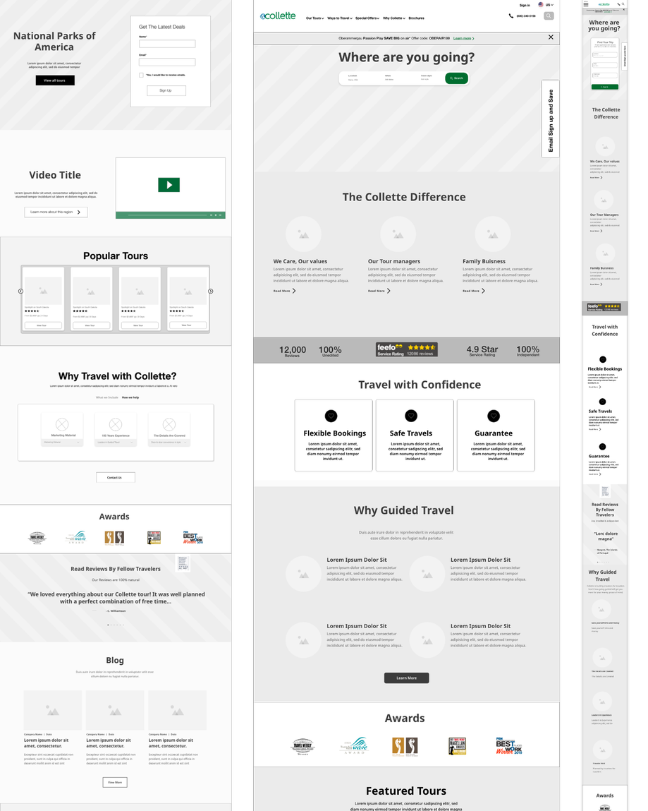
Wireframing & Prototyping
Created 30+ wireframes across:
Homepage
Product page
Search results
Iterated from low to high fidelity
Developed interactive prototypes for testing and stakeholder alignment
User Testing Outcome
Post-launch testing included 35 additional user tests (moderated + unmoderated).
Results:
21% Increase in online bookings
Reduced reliance on customer service calls
Improved clarity and trust in the product pages
Stronger brand perception
Next Steps:
Expand improvements to tour styles and destination pages
Conduct card sorting to further refine navigation
Continue scaling the design system across the platform