
WaterRower
Helping users understand differences between rowing machine models by redesigning the comparison experience.


Overview
WaterRower is a premium rowing machine brand offering 12 models on its U.S. website. Despite strong product quality, users struggled to understand the differences between models, leading to confusion and reliance on customer support.
Problem
Users couldn’t confidently choose between models.
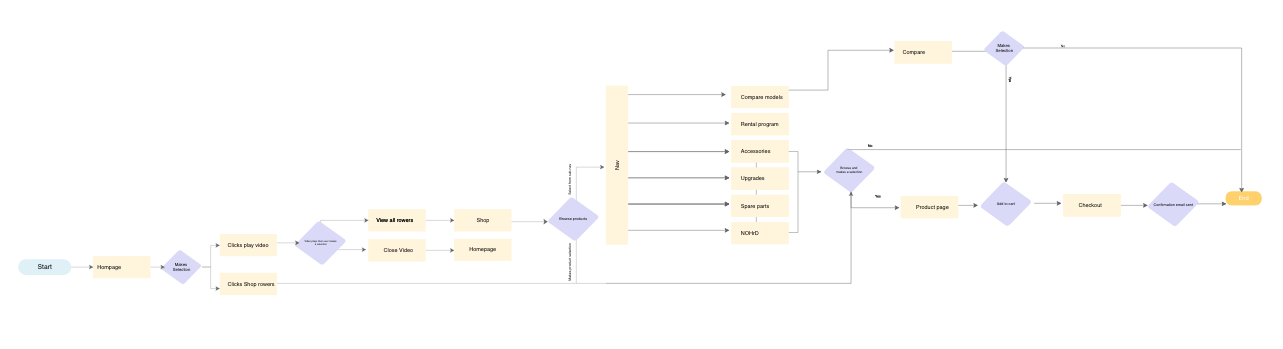
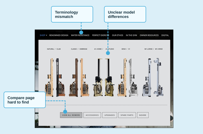
The compare page was difficult to find
Product terminology was unclear
Model differences were not meaningfully communicated
As a result, customers relied on support instead of the website to make purchase decisions.
Discovery & Research
Referencing tracking and heat maps as well as user interviews helped prioritize and showcase to stakeholders what changes were required.

Mouseflow tracking and heat map information to better understand user behavior
61% of users on mobile where its much harder to navigate
Compare page not accessible from primary navigation
Users misunderstood product terminology
Product attributes didn’t align with expectations
Key Insights
The compare page existed—but was buried in the experience. When users found it, it failed to clearly differentiate between models.
“I don’t understand the difference between some of the models”
“I do not see what is relevant to me when i look at the information list”
“I am not sure what the terms mean”
“Where is the compare page located”
Design Strategy
I focused on reducing cognitive load and improving product clarity:
1. Improve product understanding
Simplify how models are grouped
Align terminology with user expectations
2. Increase discoverability
Surface compare in navigation
Integrate comparison into browsing
3. Design for mobile-first
Prioritize clarity and ability to quickly scan information
Design Execution
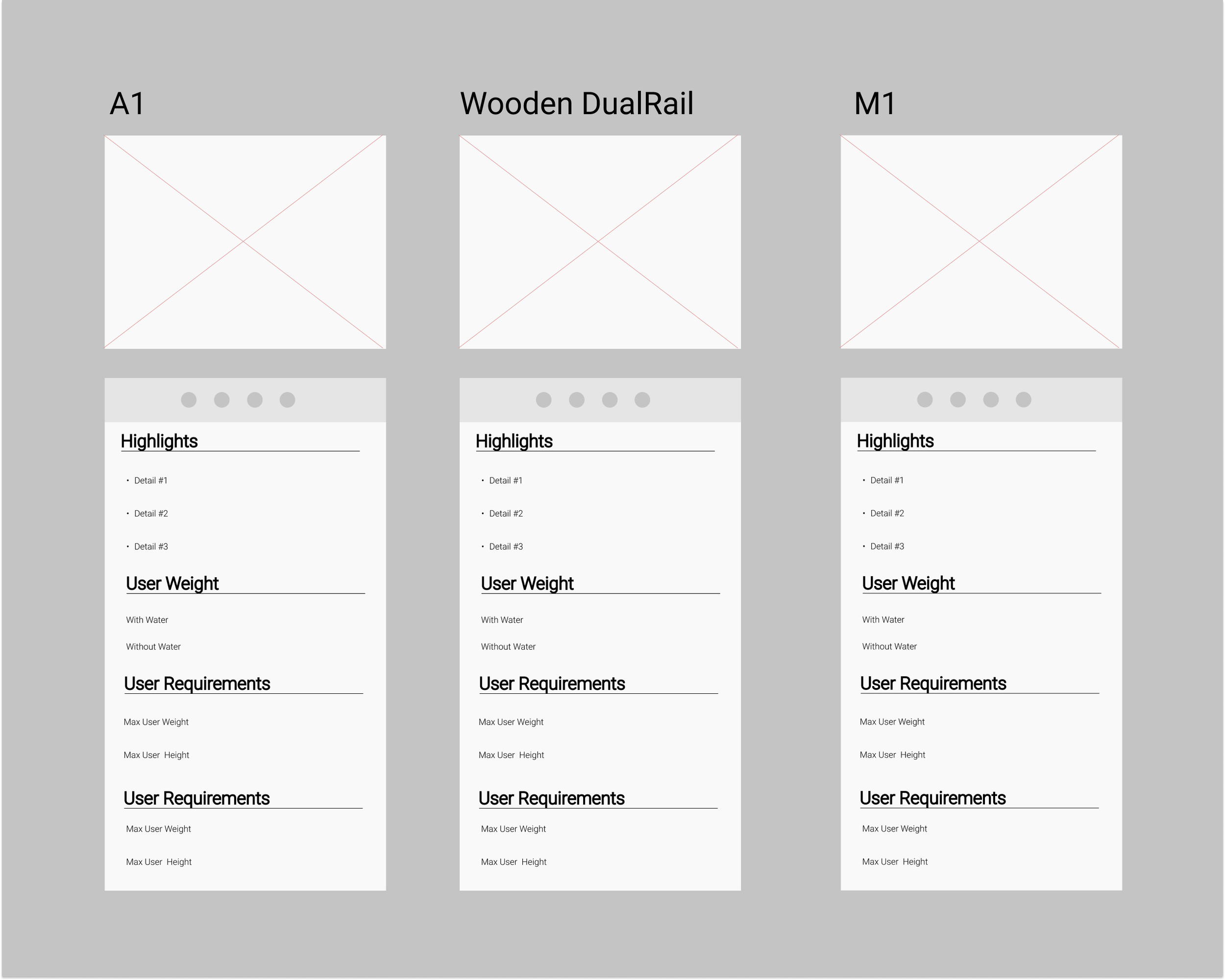
Product Grouping
Introduced product families to simplify decision-making and reduce cognitive load.
Grouped into product families
Reduced cognitive load
Clear differentiation
Compare Experience Redesign
Reframed comparison to highlight meaningful differences instead of overwhelming users with similar data.
Highlights key differences
Improved readability
Aligned terminology
Mobile-First Design
Designed for mobile-first exploration to improve usability for the majority of users.
Optimized for small screens
Scannable layout
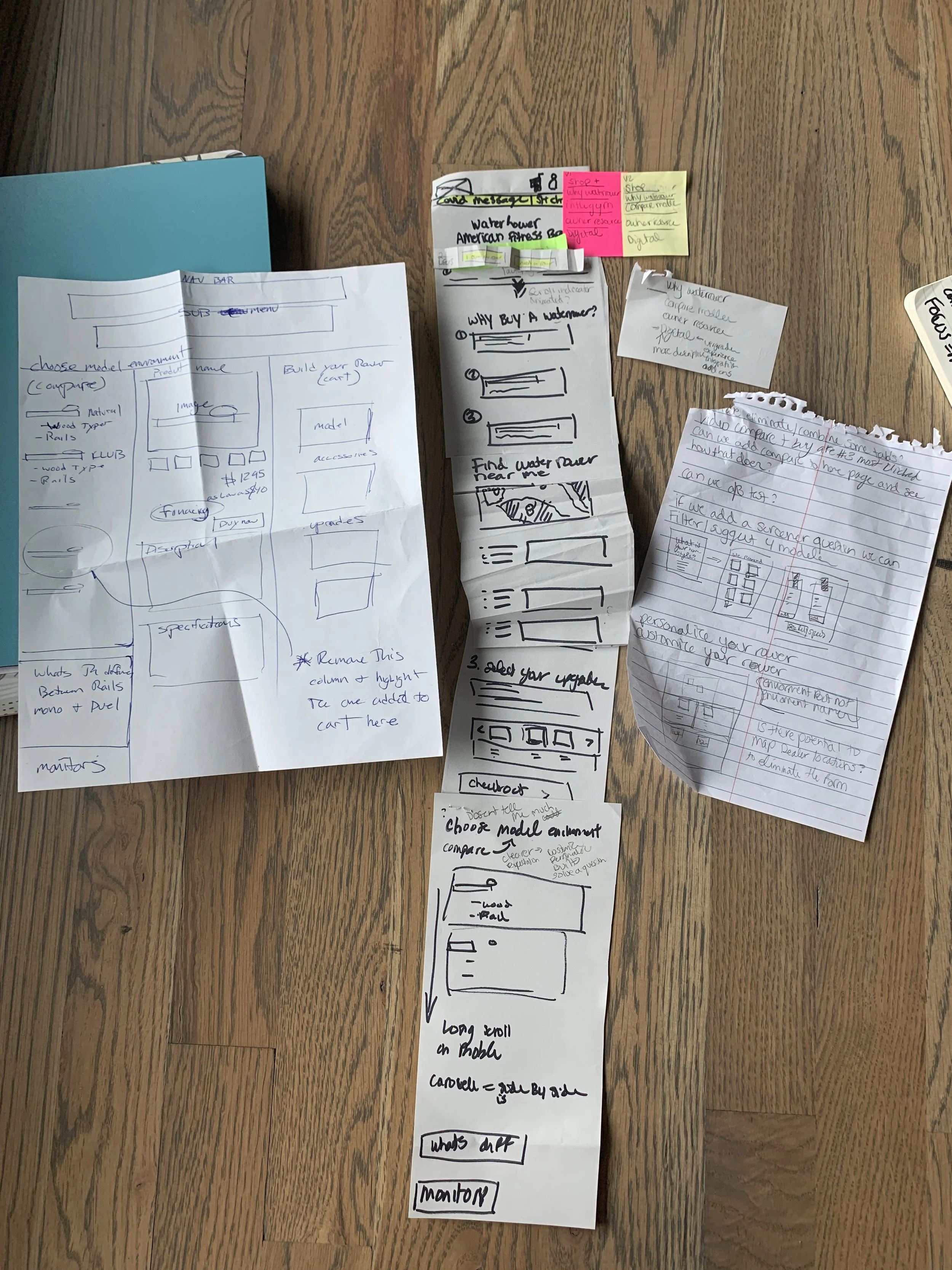
Prototype
Using Adobe XD I was able to create wireframes and finally a high fidelity prototype version of the compare page. Grouping rowing machines into families was a strategy to remove unnecessary cognitive load cutting down the confusion and creating a more digestible experience.
20+ wireframes
Paper to high fidelity
Tested with stakeholders, product specialists, and participants remotely
Outcome
While the redesign was not launched due to a shift to a headless e-commerce platform, this work:
Identified critical usability gaps
Established a clearer product structure
Highlighted the need for better terminology alignment
These insights informed future decisions around product organization and experience design.
Next Steps:
Card sorting for product naming
Validate product families
Improve comparison integration